I must say that it is discouraging how often I have to write about the Phillips Curve.
The Phillips Curve is a very simple idea and a very powerful model. It simply says that when labor is in short supply, its price goes up. In other words: labor, like everything else, is traded in the context of supply and demand, and the price is sensitive to the balance of supply and demand.
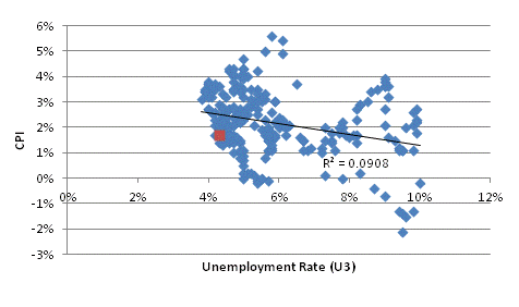
Somewhere along the line, people decided that what Phillips really meant was that low unemployment caused consumer price inflation. It turns out that doesn’t really work that way. (see chart, source BLS, showing unemployment versus CPI since 1997).

Accordingly, since the Phillips Curve is “broken,” lots of work has been done to resurrect it by “augmenting” it with expectations. This also does not work, although if you add enough variables to any model you will eventually get a decent fit.
And so here we are, with Federal Reserve officials and blue-chip economists alike bemoaning that the Fed has “only one model, and it’s broken,” when it never really worked in the first place. (Incidentally, the monetary model that relates money and velocity (via interest rates) to the price level works quite well, but apparently, they haven’t gotten around to rediscovering monetarism at the Fed).
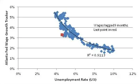
But the problem is not in our stars but in ourselves. There is nothing wrong with the Phillips Curve. The title of William Phillips’ original paper is “The Relation between Unemployment and the Rate of Change of Money Wage Rates in the United Kingdom, 1861-1957.” Note that there is nothing in that title about consumer inflation! Here is the actual Phillips Curve in the US over the last 20 years, relating the Unemployment Rate to wages 9 months later.

The trendline here is a simple power function and actually resembles the shape of Phillips’ original curve. The R-squared of 0.91, I think, sufficiently rehabilitates Phillips. Don’t you?
I haven’t done anything tricky here. The Atlanta Fed Wage Growth Tracker is a relevant measure of wages which tracks the change in the wages of continuously-employed persons, and so avoids composition effects such as the fact that when unemployment drops, lower-quality workers (who earn lower wages) are the last to be hired. The 9-month lag is a reasonable response time for employers to respond to labor conditions when they are changing rapidly such as in 2009…but even with no lag, the R-squared is still 0.73 or so, despite the rapid changes in the Unemployment Rate in 2008-09.
So let Phillips rest in peace with his considerable contribution in place. Blame the lack of inflation on someone else.
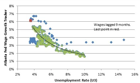
Before I add to my rant, let me update the chart above with data since then, including the pandemic. The green dots in the chart below correspond to the dots in the chart above; the blue dots are for the period since then.

Amazingly, even during the pandemic and post-pandemic period, the Phillips Curve did a pretty decent job of describing the basic shape of this relationship. The dots overall are a bit higher; that’s attributable, I think to the fact that inflation itself is higher, and I’ve done this chart in nominal terms. There is some money illusion operating (or else the latest dots would be a lot higher), but it’s still a pretty nice fit. I’ve preserved the prior regression line, but it doesn’t really shift very much.
In fact, the deviation prior to the pandemic – the little knot of blue dots to the left – are somewhat more surprising, given the much lower economic volatility when those points were laid down. But in any event, though, there is nothing obviously wrong with the Phillips Curve.
Now, it is true that the Unemployment Rate and the consumer inflation rate have not been well-behaved. But that isn’t a new phenomenon; that particular inconvenience has been that way for decades. The reason is pretty straightforward and only confusing if you spent too much time getting a Ph.D. and getting taught dumb things: the connection between wages and prices is not 1:1. It’s not constant.
And there’s no particular reason that it should be because labor is just one input into production costs, and the cost of production just affects the supply side of the supply/demand interplay, which determines the price. The really weird thing is that anyone ever thought that prices would be set by taking the current wage cost and adding a simple and stable markup.
A wage is just the price of labor, which is set in the market for labor, which involves the demand for labor and the supply of labor. The supply of labor changes very slowly. The demand for labor moves with the economic cycle. When the economic cycle is ebbing, the demand for labor falls – and that causes the quantity of labor demanded to decline (the unemployment rate goes up) as it also causes the price of labor to fall.
That’s what happens when a demand curve shifts leftward on a mostly-static supply curve: Q down, P down. When the economic cycle is flowing, the demand for labor rises, which causes the quantity of labor demanded to increase (the unemployment rate declines) and the price of labor to rise. It isn’t that hard. In fact, you learn that in pretty much the first semester of economics.
It’s those later semesters that screw up economists, encouraging them to design complicated models that are very pretty but don’t necessarily relate to real-world dynamics. We should not be at all surprised when those models don’t work in the real world.
But don’t blame Phillips.
